


0
SWGOH Character Widgets

0
SWGOH New Bundle

3
C&C Rivals: League Progression

5
C&C Rivals: Tiered Promo Offers

7
C&C Rivals: Player Profile

2
C&C Rivals: Daily Login Rewards
9
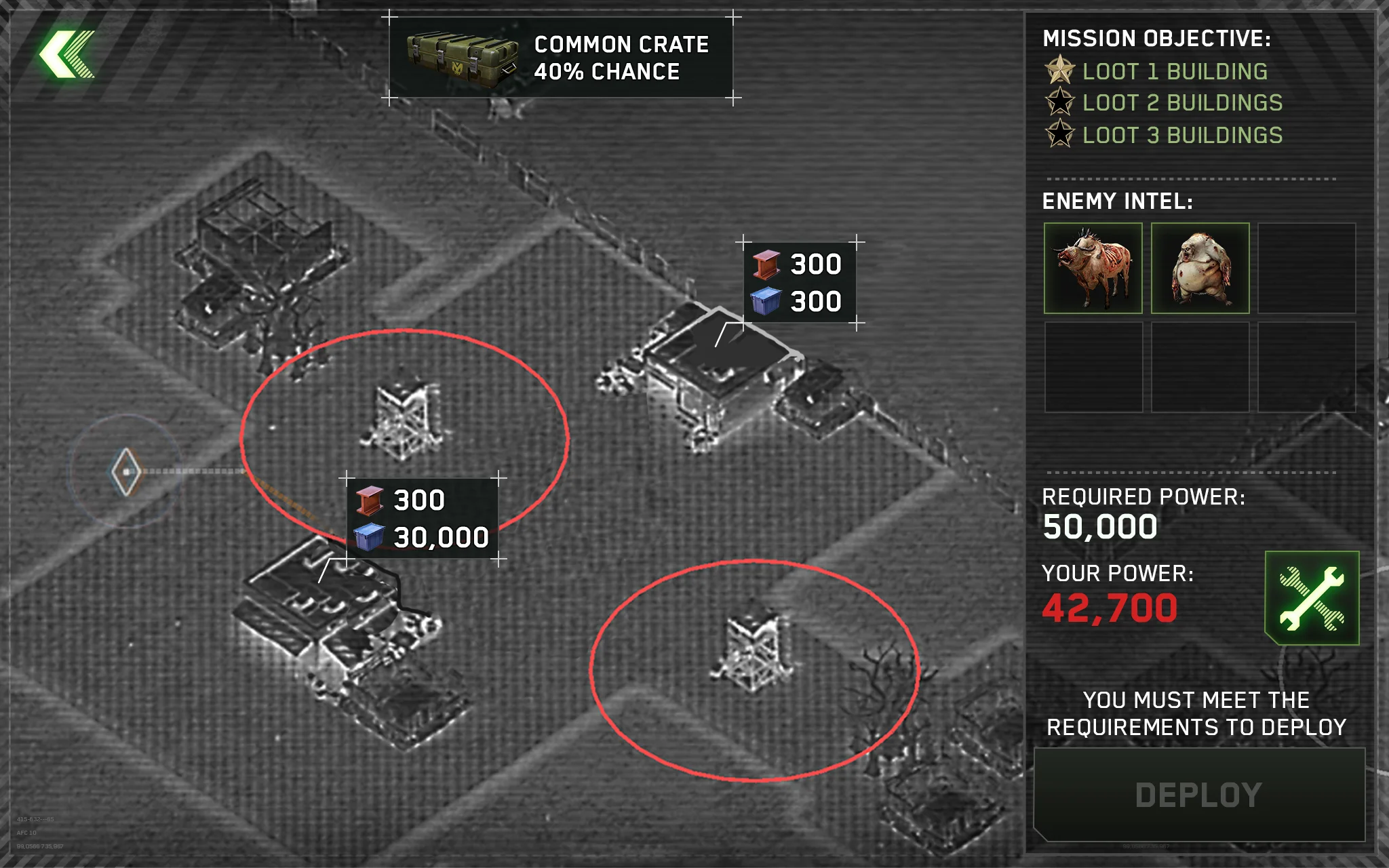
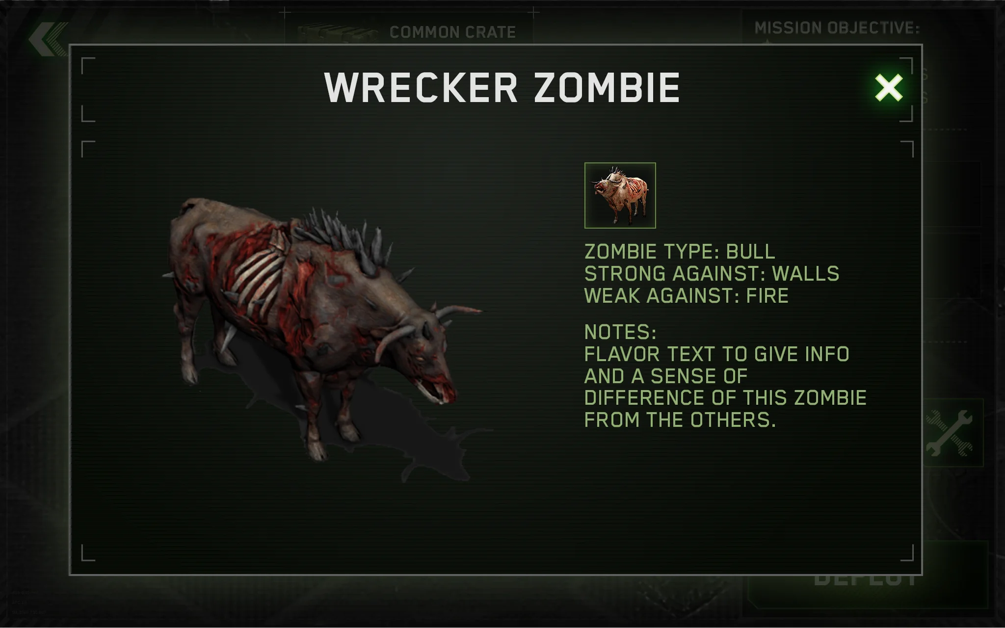
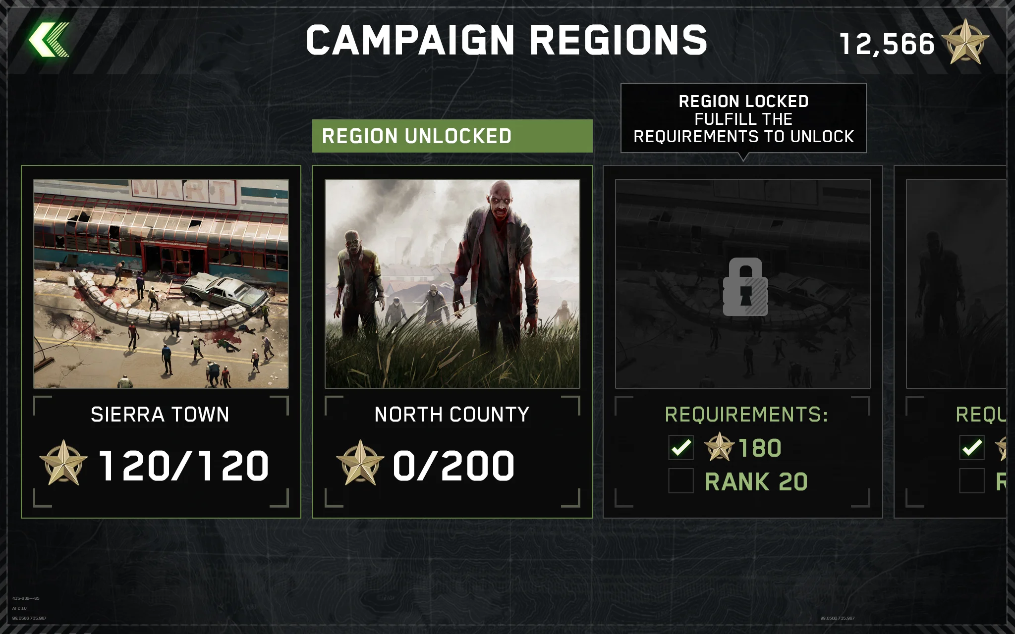
ZGS Campaign Map UI

10
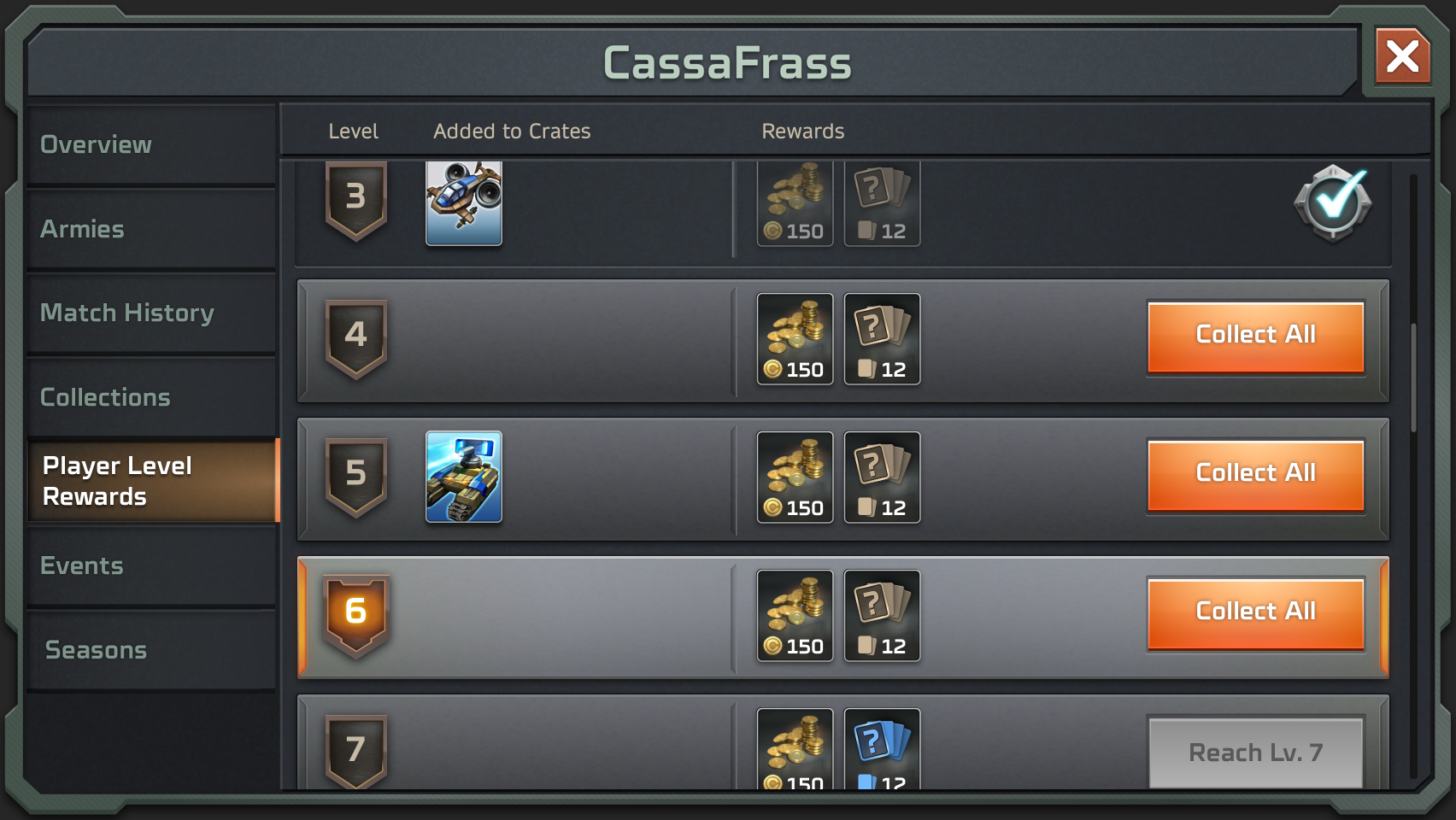
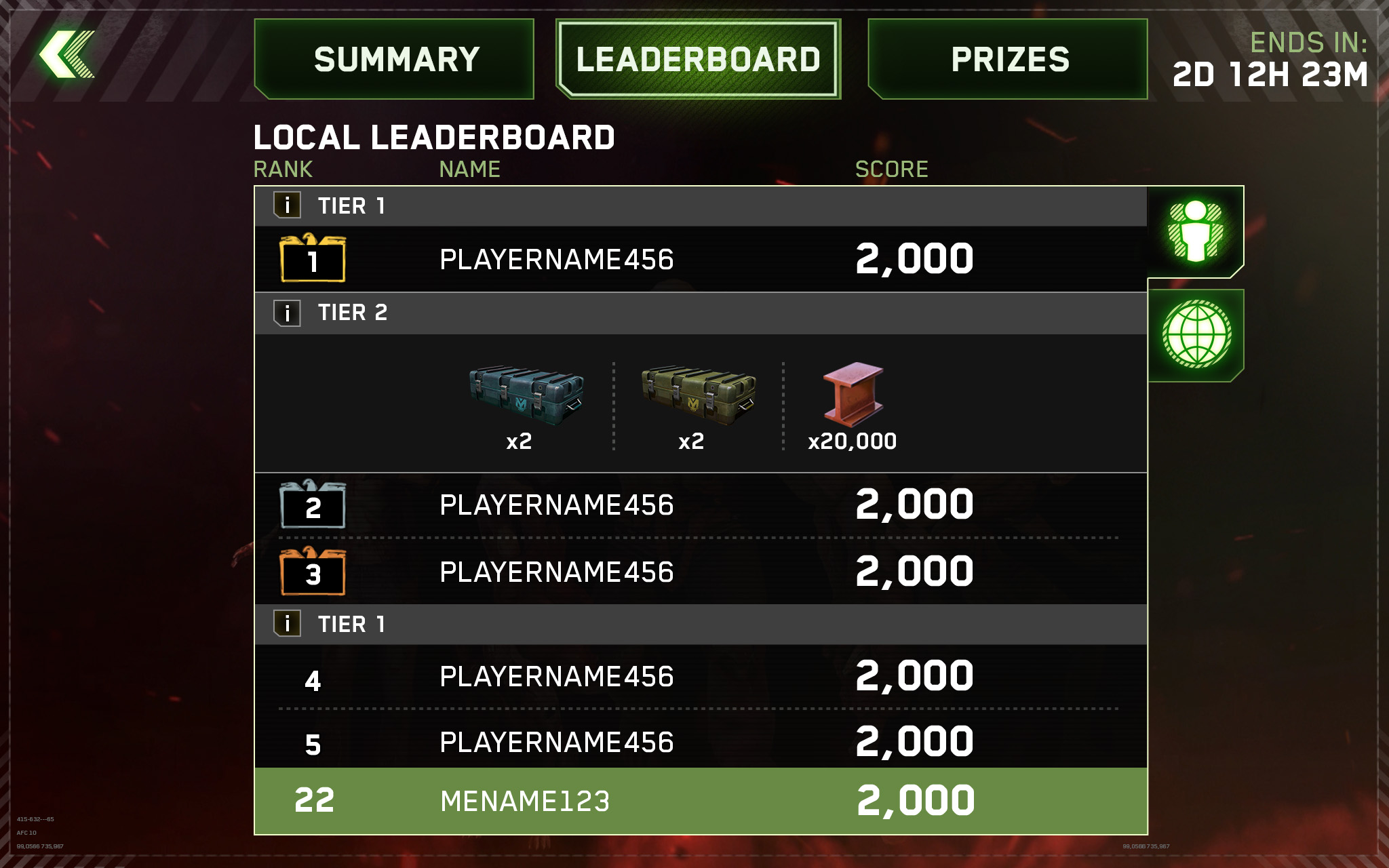
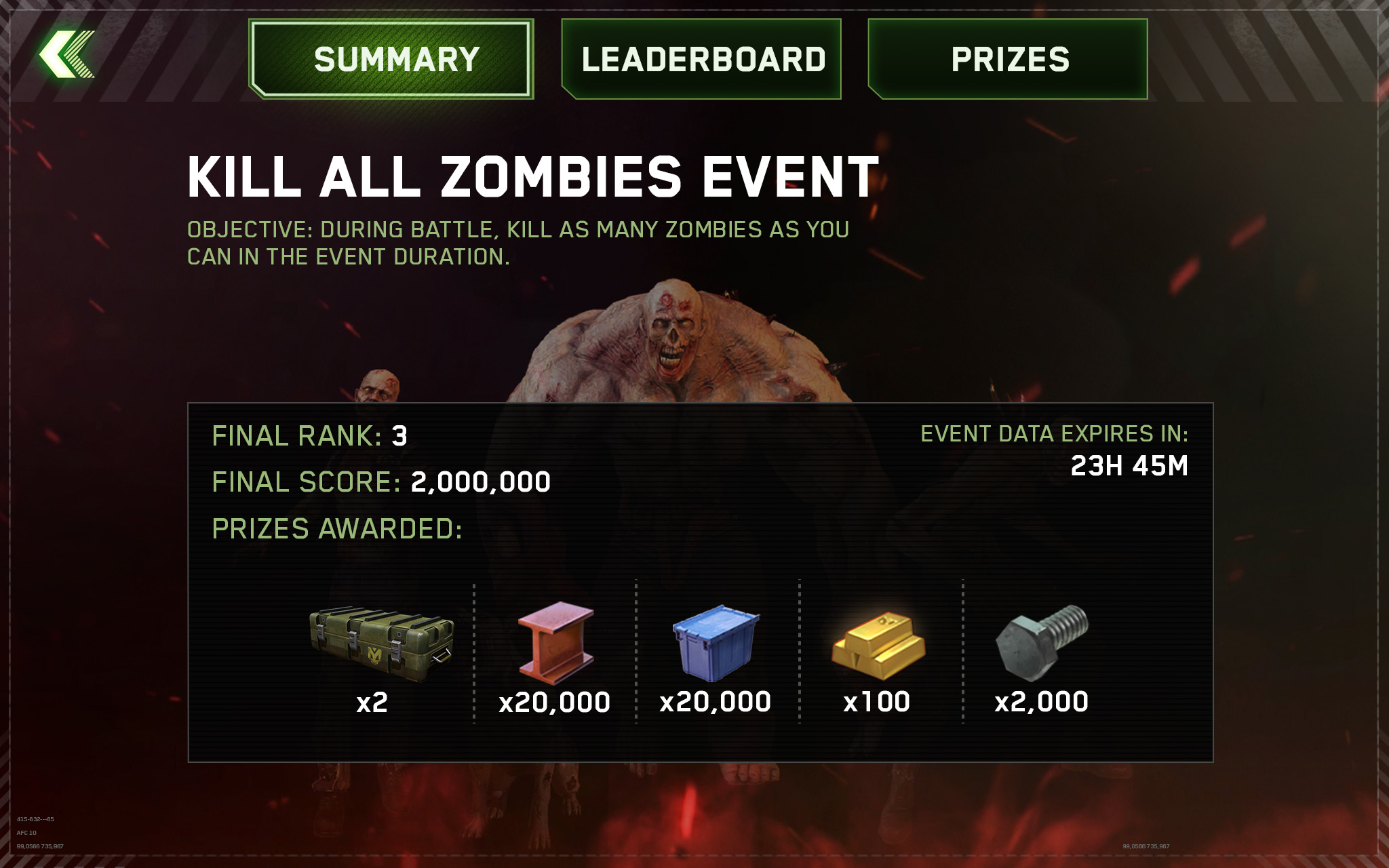
ZGS Events

4
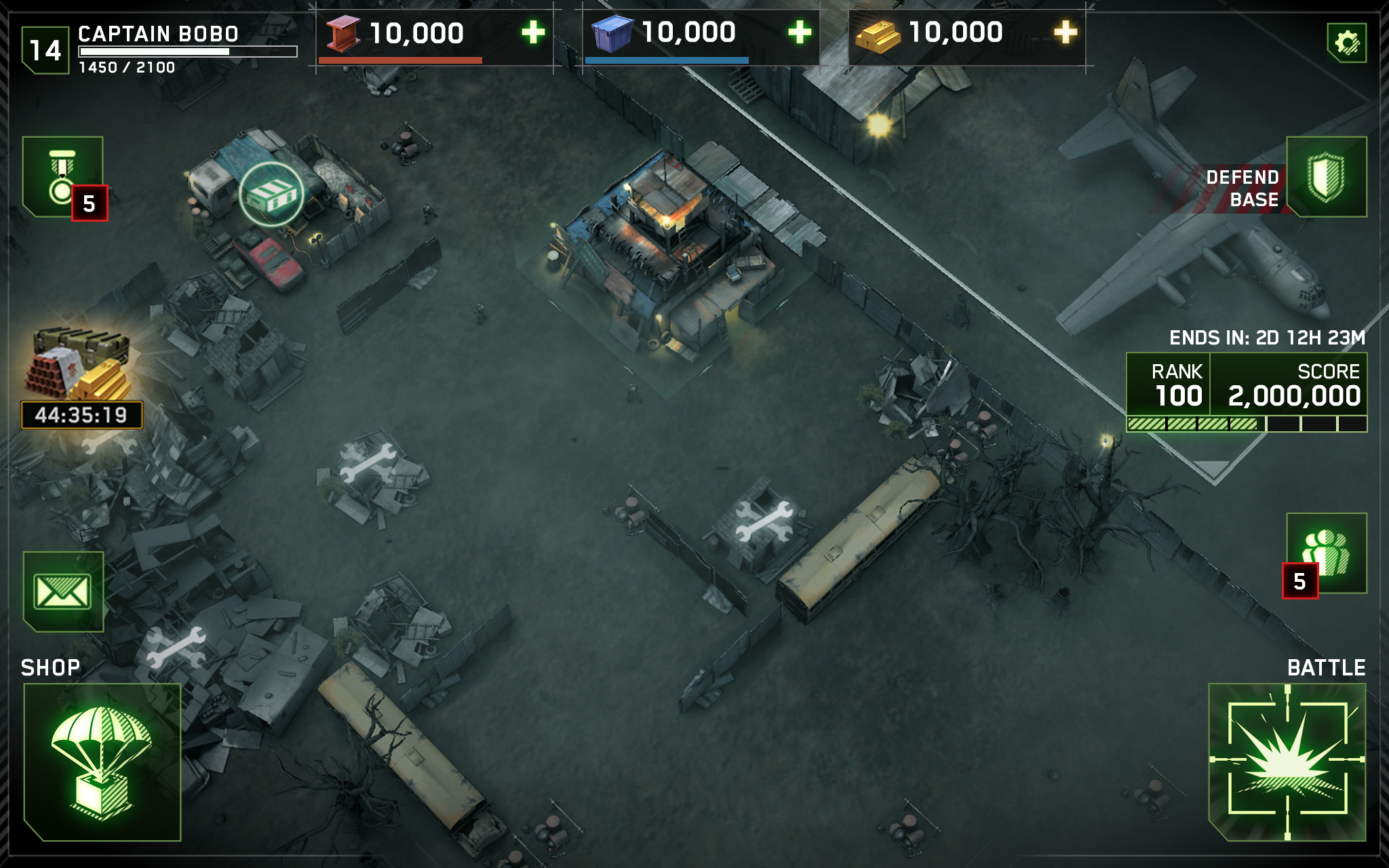
ZGS Settings Menu

8
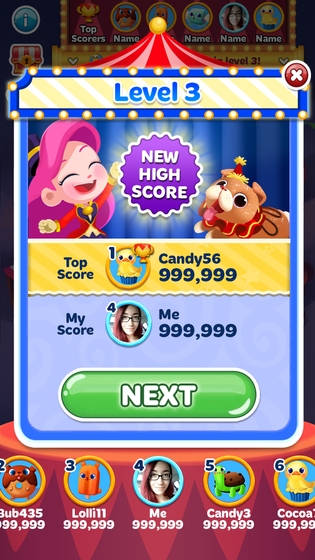
CBM High Score Tournaments
9
BM King of the Hill Event

5
FS2 Crafting Building Upgrades